UC Irvine website redesign & design system
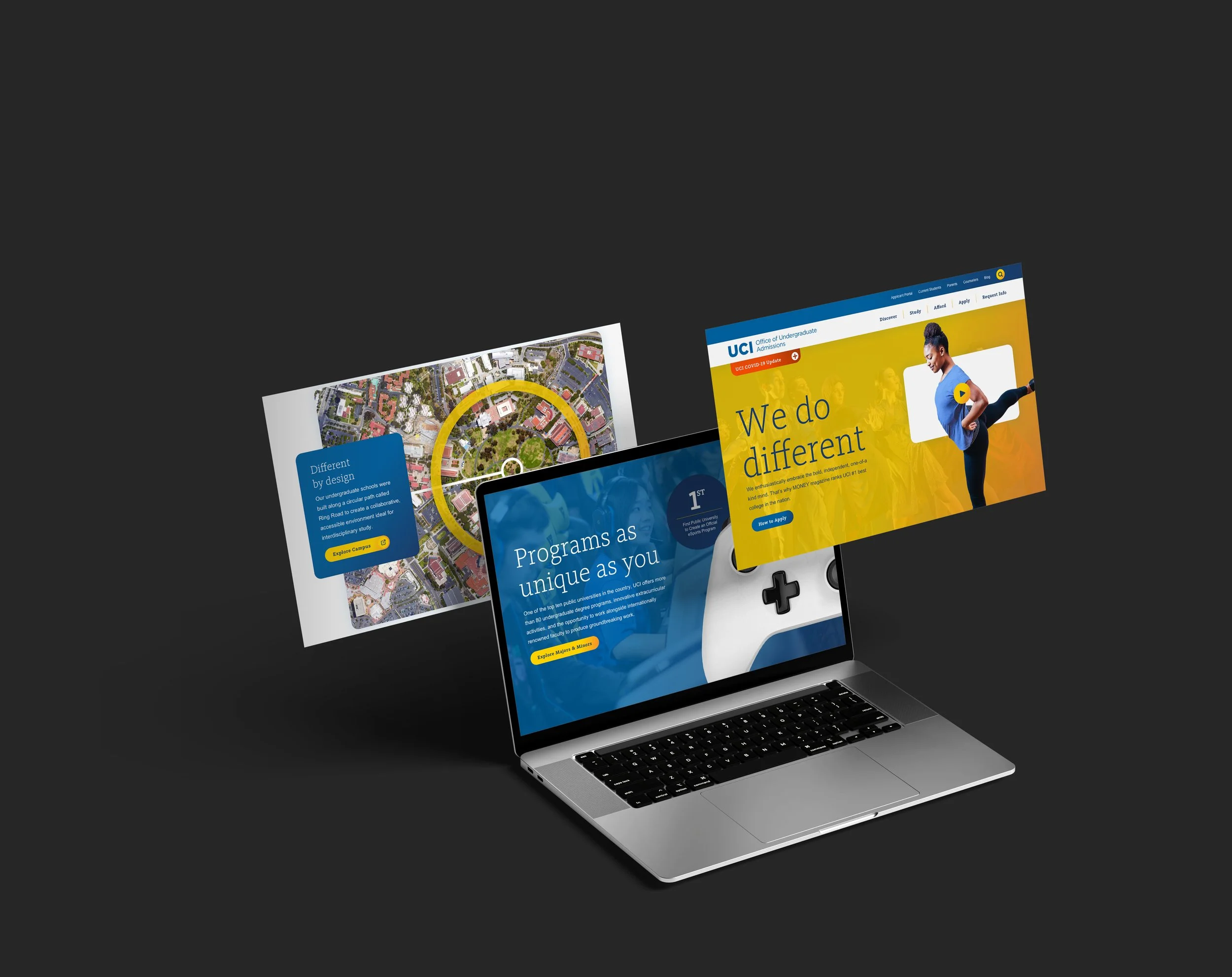
For the UCI project, I was the lead digital designer from Discovery through Launch. I defined a new design approach for the agency that effectively guided the entirety of the project. I helped facilitate in-person Discovery HCD workshops that guided the strategic approach for the design system. I coordinated with internal and client-side development teams to ensure the specs of the design system were adhered to.
THE CHALLENGE
UCI faced growing digital friction in its enrollment experience.
When I first joined BarkleyREI, the agency had recently completed a redesign of the Admissions site that led to, for the first time, UC Irvine receiving over 100,000 applications for the fall semester. A few years later, UC Irvine brought Undergraduate Admissions, Financial Aid, and the Registrar together under a new Enrollment Management division. These offices now shared responsibility for the student journey, but they continued to function as separate experiences in the digital space.
ROLE
Lead Digital Designer
PRIMARY SKILLS
Research & Discovery
UI & Interaction Design
Experience Strategy
Reusable Pattern Library
WCAG 2.1 AA Compliance
Interactive Prototyping
Stakeholder Management
Style Guide Creation
Photography Art Direction
BARKLEYOKRP WEB TEAM
Jake Metzger (Creative Director)
Heather Morrison (User Experience)
Josh Petry (Development)
Ian Moffit (Development)
Mandy McFadden (Client Experience)
Megan Kelly (Project Management)
Plus many more who deserve a massive amount of gratitude!
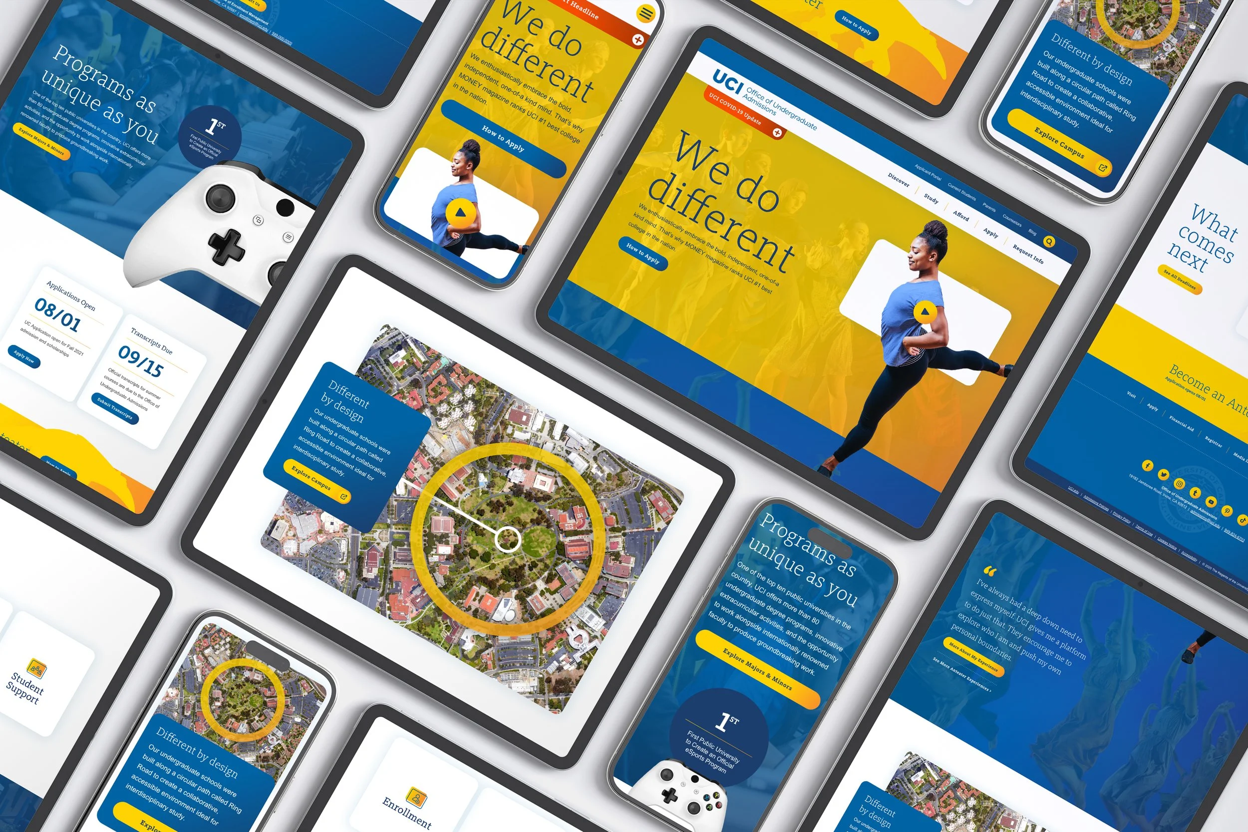
The primary purpose of the UC Irvine Admissions homepage was to highlight what made the school's students unique. The school wanted to show prospective students that it accepted and encouraged their individuality. We did this by featuring student stories in a way that emphasized their personality, hoping students could envision themselves at the school.
THE INSIGHT
Students experienced Enrollment Management as a sequence of decisions, deadlines, and moments of uncertainty.
Discovery included workshops with all teams that made up Enrollment Management, as well as current students, to understand institutional requirements and the lived student experience. A journey-mapping exercise with ten current students made the fragmentation especially visible. These findings led to three primary takeaways: the websites expect users to know what they need to do, the websites' content overwhelmingly reflects internal terminology and processes, and the overall student journey is confusing and fragmented. We couldn’t change all aspects of the process, but we still needed to streamline.
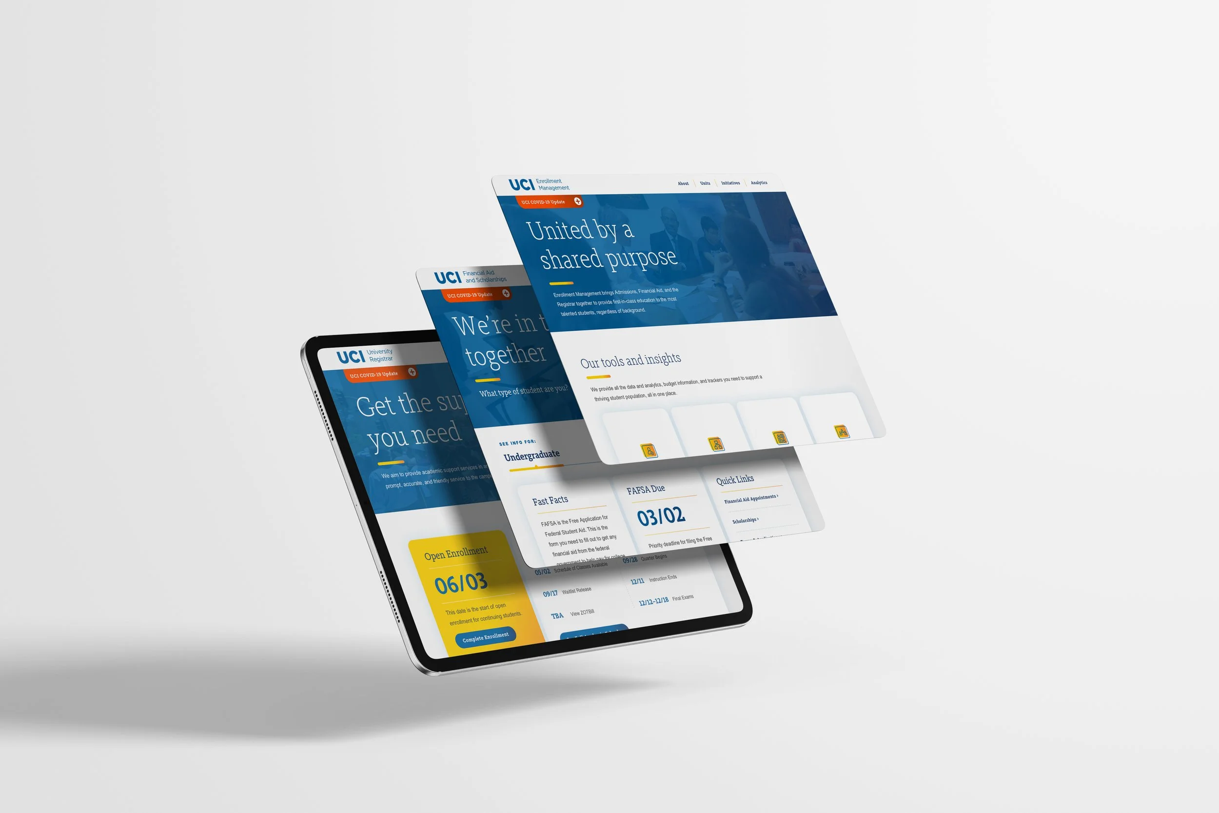
The Admissions homepage needed to be unique from the other properties. However, the Enrollment Management, Financial Aid, and Registrar homepages were designed to use the same components, so the experience felt cohesive no matter where users were in their journey.
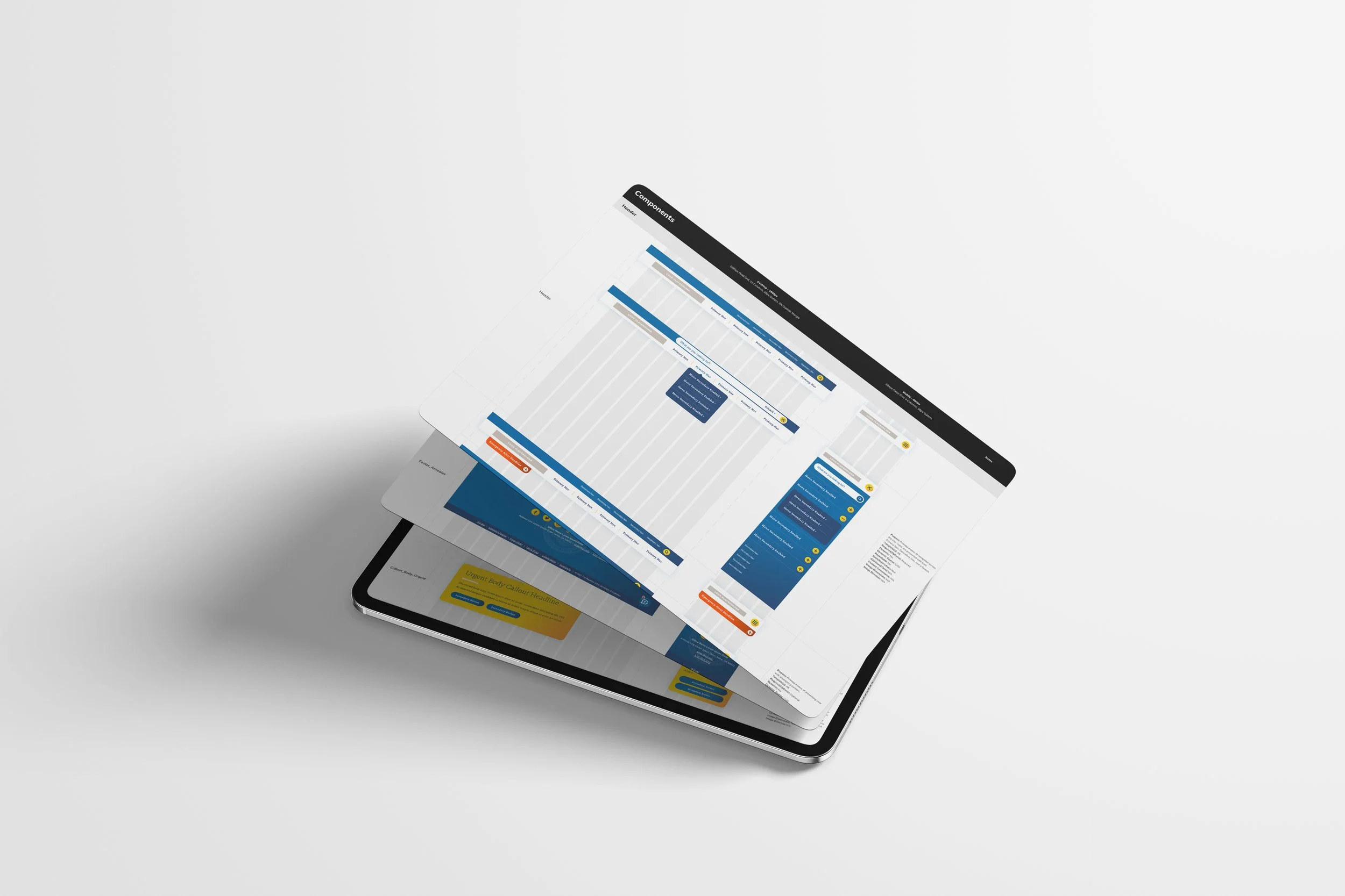
My design approach is deeply rooted in Atomic Design. I designed a comprehensive component library shared across the project's four websites. The library includes around 30 reusable components that prioritize flexibility to address the needs of all audiences across every stage of their journey.
THE SOLUTION
As lead designer, I translated the research into a digital design system that unified the visual language of the four properties. Shared typography, color usage, and interaction patterns created continuity without sacrificing the nuances of each site’s distinct role. With my unrelenting advocacy, this was the agency’s first project of this scale to implement an Atomic Design methodology from the outset.
The extensive library of Cascade CMS components and templates were organized around what students needed to know and do at specific moments of their journey. Clear next steps, deadline information, and access to help were prioritized over deeper policy content.
To support telling the stories of what makes UCI students (Anteaters) so unique, I art directed a multi-day, on-location shoot capturing lifestyle photography and video content.
The final solution was a responsive, accessible digital design system that was built to scale even beyond the four websites within our immediate scope.